

 Language
 English
 Français
 Español
 Deutsch
Color and Material Pairing Tips: Make Your Dining Chair a Dining Room Highlight
2026-07-17
Understanding the Foundation of Dining Chair Design
The dining chair represents far more than a functional seating solution. It serves as a bridge between aesthetics and comfort, anchoring the visual narrative of your dining space. When thoughtfully selected and coordinated, a well-designed dining chair can transform an entire room from ordinary to extraordinary. The challenge lies not merely in choosing a chair, but in understanding how its color and material composition interact with the surrounding environment.
Every material carries inherent visual and tactile properties that influence how light interacts with it, how it weathers over time, and most importantly, how it communicates within your design scheme. Wood finishes range from deep espresso undertones to bright honey tones. Upholstery fabrics vary from matte textures to lustrous weaves. Metal accents can appear cold or warm depending on their finish. Leather develops character and patina that synthetic alternatives cannot replicate. Understanding these distinctions forms the cornerstone of effective design decisions.
The Role of Material Selection in Color Harmony
Wood Finishes and Their Color Implications
Wooden dining chair frames establish the foundational color palette for your seating arrangement. The wood species and finishing technique dramatically influence the overall color temperature of the chair. Light oak projects a neutral, bright aesthetic that pairs well with contemporary spaces. Walnut delivers deep, sophisticated warmth suitable for traditional and transitional settings. White-washed or bleached woods create a scandinavian or coastal vibe, offering versatility with various upholstery colors.
When selecting wood tone, consider the existing floor and table materials in your dining room. Chairs should either complement or intentionally contrast these elements. Matching wood tones across furniture pieces creates visual continuity, while deliberately choosing contrasting tones can establish focal points and dynamic interest.
Upholstery Materials and Texture Interaction
The fabric or leather covering your dining chair dramatically affects how color appears to the human eye. A rich navy velvet absorbs light differently than a navy linen weave. Matte finishes diminish color saturation, making hues appear more subdued. Glossy or shiny fabrics intensify color perception, making the same dye appear more vivid and dramatic.
Natural fibers including linen, cotton, and wool offer breathable comfort with subtle texture variations that add depth. Synthetic blends provide durability and stain resistance, with modern manufacturing creating increasingly convincing texture replication. Leather, whether genuine or high-quality alternatives, introduces a sophisticated element that evolves with use, developing a unique patina over time.
Metal Accents and Finish Considerations
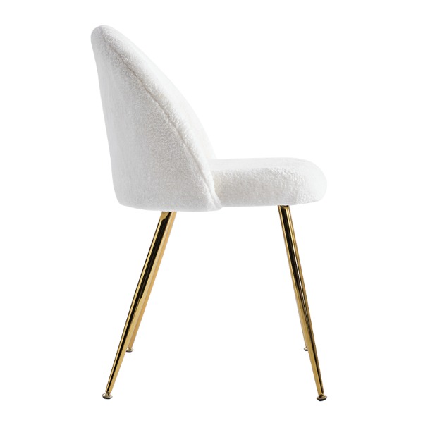
Metal components—whether legs, frames, or decorative elements—serve as secondary design anchors. Brushed stainless steel projects modern minimalism. Matte black creates contemporary edge and versatility. Antique brass introduces warmth and transitional sophistication. Polished chrome delivers reflective brightness. Powder-coated metals in bold colors can inject personality and contemporary flair.
The finish of metal accents should harmonize with other materials in your dining space. Mixing metal finishes deliberately can create eclectic interest, but random combinations risk visual discord. A general principle suggests limiting metal finishes to two complementary types per space.
Color Theory Applied to Dining Chair Design
Monochromatic Schemes for Sophisticated Simplicity
A monochromatic approach uses variations within a single color family. For example, pairing a naturally finished wooden frame with a warm taupe upholstered seat creates visual cohesion through tonal variation rather than chromatic diversity. This strategy works particularly well in minimalist or scandinavian-inspired spaces where restraint creates impact.
Monochromatic schemes offer psychological benefits as well. They create calming, unified spaces that feel intentional and curated. This approach is especially effective in open-concept dining areas where visual simplicity helps the space feel larger and less cluttered.
Complementary Color Pairings
Complementary colors sit opposite each other on the color wheel, creating natural visual tension and energy. A warm wood frame paired with cool blue-gray upholstery creates sophisticated contrast. Mustard yellow upholstery with deep blue-green wooden legs delivers contemporary vibrancy. These pairings work best when one color dominates while the other plays a supporting role.
Analogous Color Harmonies
Analogous colors sit adjacent on the color wheel, creating harmonious and cohesive schemes. Imagine a walnut frame (warm brown) paired with burnt orange upholstery, or a light oak base (warm beige) with warm gray cushioning. These combinations feel natural and unified while still offering visual interest through material variation.
Neutral Foundations with Bold Accents
Pairing neutral materials with strategic color elements provides flexibility and longevity. A naturally finished wooden frame with cream linen upholstery serves as a versatile foundation, allowing table settings and accessories to provide color interest. Alternatively, neutral upholstery on a frame with distinctive wood stain or metal finish creates focal point through material rather than color.
Practical Material and Color Combinations That Work
| Frame Material | Upholstery Color | Metal Finish | Design Style |
|---|---|---|---|
| Walnut Wood | Charcoal Gray | Brushed Steel | Contemporary |
| Light Oak | Natural Linen | Matte Black | Scandinavian |
| White-washed Oak | Warm Sage | Antique Brass | Transitional |
| Black Stained Ash | Cream Velvet | Polished Chrome | Modern Luxe |
| Natural Beech | Deep Teal | Matte Gold | Eclectic Modern |
Case Study Framework: The Neutral Anchor Strategy
Many successful dining rooms employ a neutral anchor strategy where the dining chair provides stability through material and finish consistency. For instance, a set of six chairs with consistent wooden frames and neutral upholstery in beige, gray, or off-white creates visual rhythm. The wood tone remains the primary focal point, while the unified upholstery allows other elements—table surface, wall color, lighting fixtures—to command attention.
Case Study Framework: The Statement Piece Approach
Alternatively, a single accent chair or pair of statement chairs featuring bold color or distinctive material can anchor the entire dining room aesthetic. A deep emerald green dining chair with brass legs becomes an intentional focal point, with surrounding elements coordinating rather than competing. This approach works particularly well in spaces with neutral walls and traditional wood tables.
Detailed Material Considerations for Upholstery Selection
Natural Fiber Upholstery
Cotton upholstery offers breathability and a soft aesthetic. Colors appear natural and organic without artificial sheen. Cotton pairs beautifully with light wood tones, creating a casual, approachable dining environment. The main consideration is durability—cotton shows wear patterns and staining more visibly than synthetic alternatives.
Linen upholstery conveys sophisticated casualness. The natural slubs and texture variations in linen weaves create visual interest and depth. Linen accepts dyes beautifully, offering rich color saturation. Like cotton, linen requires regular maintenance and shows patina visibly.
Wool upholstery delivers warmth and natural stain resistance. Wool fibers repel liquids, making them practical for dining chairs. Colors in wool appear rich and grounded, particularly in earth tones and jewel tones. Wool works exceptionally well with darker wood frames and provides excellent durability over decades of use.
Synthetic and Blended Upholstery
Polyester blends dominate contemporary dining chair manufacturing due to cost-effectiveness and performance characteristics. Modern polyester fabrics convincingly replicate natural fiber aesthetics while offering superior stain resistance and durability. Color options are virtually unlimited with synthetic fibers, and the materials resist fading from sunlight exposure.
Performance fabrics engineered specifically for high-traffic areas offer specialized advantages. These materials repel liquids, resist staining, and clean easily. For families with children or those prioritizing practicality, performance upholstery on dining chairs makes genuine sense. Aesthetically, quality performance fabrics rival traditional materials in appearance.
Leather Upholstery
Genuine leather represents a premium choice for dining chairs. Leather develops patina over time, becoming more beautiful with age and use. The material breathes naturally and feels luxurious. Full-grain leather shows all natural markings, creating character and individuality. Top-grain leather receives additional finishing for consistency while maintaining natural properties.
Leather color selection requires consideration of undertones. Warm cognac leather pairs beautifully with walnut frames and warm lighting. Cool chocolate leather complements gray and blue accents. Caramel and tan leathers work as neutral anchors with nearly any frame material or metal finish.
Bonded leather and faux leather alternatives provide affordable approximations. Quality versions convincingly replicate leather appearance and feel, though longevity may not match genuine leather. These alternatives work well in high-traffic or less-formal dining spaces.
Mastering Frame Finishes and Their Color Impact
Natural Wood Finishes
Natural finishes reveal the inherent wood grain and color variation. Light sanding and clear matte lacquer preserves authenticity while protecting wood. This approach highlights wood character and works beautifully with natural, organic upholstery colors. Natural finishes pair well with neutral palettes and create warmth in minimalist spaces.
Stained and Pigmented Finishes
Wood stains penetrate the grain while enriching color depth. Walnut stain deepens natural oak to rich chocolate tones. Mahogany stain introduces reddish warmth. Gray stains create contemporary cool tones. Pickled or whitewashed finishes lighten wood while maintaining grain visibility. These finishes offer enormous color versatility while respecting wood structure.
Painted Frames
Painting dining chair frames in solid colors provides maximum design flexibility. A soft white or cream painted frame offers sophisticated neutrality with nearly any upholstery color. Deep navy or charcoal frames create dramatic contemporary statements. Pale blue or sage painted frames work beautifully with natural fabric upholstery. The key consideration is maintenance—painted finishes can chip with heavy use, requiring touch-ups over time.
Distressed and Rustic Finishes
Intentionally distressed finishes create vintage or rustic character. A painted frame with distressed edges revealing wood beneath adds depth and authenticity. These finishes work particularly well in traditional, farmhouse, or eclectic design schemes. Distressed finishes hide wear naturally, improving practical longevity of the piece.
Applying Color Selection Based on Space Characteristics
Light and Shadow Considerations
Natural and artificial lighting dramatically affects color perception. Warm incandescent lighting flatters warm upholstery colors like gold, rust, and warm gray. Cool LED lighting showcases cool-toned upholstery including blue, gray, and green. Consider the primary lighting in your dining space when selecting colors. A room with predominantly north-facing windows receives cool, indirect light that makes warm-colored upholstery appear dull. In this situation, slightly warmer or more saturated colors compensate for the cool light.
Test upholstery samples in your actual dining space under both natural and artificial light before making final decisions. Colors shift dramatically between home improvement center lighting and your residential environment.
Space Size and Color Psychology
Darker, more saturated upholstery colors visually recede, making dining chairs appear smaller and spaces feel cozier. Lighter and more muted upholstery expands visual space and creates airiness. In smaller dining rooms, lighter upholstery on chairs preserves open-feeling architecture. In larger, formal dining rooms, deeper-toned upholstery anchors space and creates sophistication.
Color Coordination with Existing Dining Room Elements
The dining table surface color represents a critical coordination factor. Medium-to-dark wood tables pair beautifully with neutral chair upholstery ranging from cream to charcoal gray, allowing the table to command focus. Light-colored wood tables benefit from slightly warmer or more saturated chair upholstery tones to create visual balance. Glass or stone tables offer neutral backgrounds that work with virtually any chair color, allowing chairs to establish the dominant color scheme.
Wall color similarly influences chair color selection. Warm-colored walls work beautifully with natural wood-frame chairs and warm-toned upholstery. Cool-colored walls coordinate well with contemporary materials and cool-toned fabrics. Neutral wall colors provide maximum flexibility for chair color choices.
Combining Multiple Materials for Dynamic Interest
Wood Plus Upholstery Combinations
The most common approach combines a wood frame with fabric or leather upholstery. This pairing allows design flexibility while maintaining structural integrity and traditional comfort. A walnut frame with contrasting gray upholstery creates visual hierarchy. A light oak frame with matching neutral upholstery offers cohesive simplicity. The frame color should either match the upholstery family (monochromatic approach) or contrast deliberately (complementary approach).
Metal and Upholstery Layering
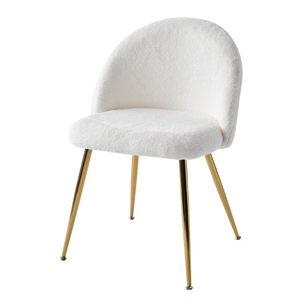
Chairs with metal bases and upholstered seats create contemporary interest through material contrast. A chrome metal base supporting a soft fabric seat offers tactile contrast between cold industrial metal and warm textile. This approach works beautifully in modern and eclectic dining rooms. The metal color should coordinate with other metal elements in the space, while upholstery color can either echo or contrast the overall palette.
Triple Material Integration
Advanced design incorporates wood, upholstery, and metal finishes simultaneously. For example, a walnut frame with brass leg accents and cream linen upholstery integrates three materials into a cohesive statement. This approach requires careful consideration to ensure materials work together rather than compete. Typically, one material (usually the frame) dominates, with secondary materials playing supporting roles.
Mixed Material Sets
Contemporary design trends include intentionally mixed dining chair sets where individual chairs feature different materials or colors while maintaining visual family resemblance. For example, a set might include two upholstered chairs with metal legs, two wooden frame chairs with fabric seats, and one accent chair in leather. This approach requires confidence in design principles and works best when all chairs share common elements—similar height, color palette reference points, or metal finish consistency.
Visual Material and Color Pairing Guide
Material and Color Selection Checklist
Before finalizing your dining chair selection, work through this comprehensive framework:
- Identify your primary design style: traditional, transitional, contemporary, scandinavian, eclectic, or other
- Assess your existing dining table material and color
- Document your wall color and undertone (warm or cool)
- Determine primary and secondary lighting in your dining space
- Evaluate floor materials and how they interact with potential chair colors
- Consider lifestyle factors: young children, pets, frequency of entertaining
- Establish budget range and prioritize durability versus aesthetics
- Gather color and material samples and observe them in your actual space
- Test samples under both natural and artificial lighting conditions
- Evaluate color consistency across multiple angles and distances
- Consider how chair colors appear beside your table setting and tableware
- Assess whether the selection coordinates with other furniture and fixtures
- Verify upholstery performance characteristics match your practical needs
- Confirm frame construction quality and anticipated longevity
- Make final decision with confidence based on holistic space consideration
Common Color and Material Pairing Mistakes to Avoid
Ignoring Lighting Conditions
Selecting chair colors without considering your specific lighting environment creates disappointment upon arrival. A beautiful blue selected under fluorescent showroom lighting may appear lifeless in warm residential incandescent light. Always test in your actual dining space at different times of day.
Mismatching Material Temperature
Pairing warm wood finishes with cool-temperature upholstery and cool metal finishes creates visual discord. While intentional contrast can work, unintentional temperature mismatches feel jarring and unresolved. Maintain consistency in temperature across frame, upholstery, and metal finishes unless deliberately creating contrast.
Overwhelming the Space with Color
Choosing deeply saturated colors for all dining chairs in a room with strong wall color and bold table finish creates visual cacophony. Let one element—either the table, walls, or chairs—command attention while others play supporting roles.
Neglecting Maintenance and Wear Patterns
Light-colored upholstery shows staining and wear more visibly than medium or dark tones. In high-use dining rooms, overly light fabrics require constant vigilance. Consider the practical reality of maintenance alongside aesthetic preference.
Choosing Material Based on Price Alone
An inexpensive synthetic upholstery that clashes with your table and walls wastes money through visual dissatisfaction. A moderately priced natural fiber in perfect color coordination delivers better long-term value through sustained satisfaction.
Forgetting About Texture Variety
Using completely smooth, matte materials throughout creates flatness. Incorporating texture through wood grain, fabric weave, or finish variation adds sophistication and visual interest. A matte upholstery on a naturally finished wooden frame with brushed metal accents offers pleasing textural variation.
Contemporary Trends in Dining Chair Material and Color Pairing
Warm Neutrality with Textural Emphasis
Current trends favor neutral color palettes anchored by exceptional material quality and texture. Cream linen upholstery on naturally finished wood frames with subtle texture plays represents contemporary luxury. This approach prioritizes quality materials and craftsmanship over bold color statements.
Jewel Tone Sophistication
Deep, saturated jewel tones including emerald green, sapphire blue, and rich burgundy appear increasingly in contemporary dining spaces. These colors work particularly well on dining chairs because they create focal point interest while remaining versatile enough to coordinate with various table and wall colors. Jewel tones pair beautifully with brass metal finishes and natural wood frames.
Mixed Material and Finish Dining Sets
Intentionally mixed dining chair sets featuring varied materials and finishes while maintaining color family unity reflects contemporary design confidence. A set might include three upholstered chairs with wood frames, two with metal bases and fabric seats, and one accent chair in leather—all in coordinating earth tones or cool grays.
Sustainable Material Emphasis
Increased consumer awareness of environmental impact drives selection toward natural, sustainably sourced materials. Organic cotton and linen upholstery, FSC-certified wood frames, and recycled metal components attract environmentally conscious buyers. These materials align with contemporary design aesthetics while addressing sustainability concerns.
Maximalist Color Combinations
Countering minimalist trends, some contemporary designers embrace bold, unexpected color combinations. Burgundy upholstery on black wooden frames with gold metal accents creates theatrical drama. This approach requires confidence and works best in spaces where personality matters more than timeless neutrality.
Coordinating Dining Chairs Across Design Styles
Traditional Design Integration
Traditional dining rooms benefit from coordinated material and color consistency. A set of six matching chairs featuring identical wood stain, upholstery color, and metal hardware creates formal elegance. Warm wood tones including mahogany, cherry, or walnut paired with sophisticated neutral upholstery or damask fabric patterns embody traditional aesthetics. Metal finishes should favor antique brass or oil-rubbed bronze.
Transitional Design Approach
Transitional dining rooms blend traditional and contemporary elements through material selection. Naturally finished wood frames with contemporary neutral upholstery in linen or performance fabric create bridge aesthetic. Metal finishes can lean toward brushed nickel or matte black, offering contemporary edge while respecting traditional form. The dining chair typically features clean lines with subtle traditional details rather than elaborate ornamentation.
Contemporary and Modern Design
Contemporary dining chairs emphasize clean lines, geometric forms, and material authenticity. Natural wood frames in their unadorned state, or painted frames in bold colors pair with solid-colored upholstery in neutral, jewel, or accent tones. Metal finishes favor matte black, brushed stainless steel, or powder-coated colors. Materials appear honest rather than ornate—genuine leather rather than faux, real wood rather than veneer.
Scandinavian Design Alignment
Scandinavian dining chairs prioritize functional beauty and light material aesthetics. Light oak or white-washed wood frames pair with natural linen or wool upholstery in cream, gray, or warm beige. Metal legs appear minimal and utilitarian. The overall effect emphasizes simplicity, functionality, and natural material integrity. Scandinavian design favors sustainable materials and timeless aesthetic over trendy color choices.
Eclectic and Maximalist Styles
Eclectic design welcomes color, pattern, and material experimentation. An eclectic dining room might feature mismatched chairs unified through color family coordination rather than exact matching. One chair in teal velvet, another in cream boucle, a third in natural leather—all on wooden frames in complementary tones—creates curated variety. This approach requires confident design knowledge to prevent appearing accidental rather than intentional.
Optimizing Color and Material Choices Within Budget Parameters
Investment Strategy for Premium Materials
Genuine leather upholstery on dining chairs represents an investment that appreciates in value over time. The material develops character and patina, becoming more beautiful with age. If budget allows for premium material on a subset of chairs (perhaps four leather chairs with two upholstered alternatives), this creates layered interest while controlling costs. Alternatively, prioritize investment materials on chairs with highest use and relegating secondary options to accent seats.
Leveraging Natural Wood for Economy
Naturally finished or simply stained wood frames cost less than elaborately painted or distressed options while maintaining aesthetic value. A light oak naturally finished frame paired with quality upholstery delivers designer sensibility without premium pricing. The wood grain itself provides visual interest, reducing reliance on complex finishes.
Strategic Upholstery Investment
Modern performance fabrics engineered for durability often cost similarly to traditional fabrics while delivering superior practicality. In high-use dining rooms or homes with children, performance upholstery represents smart economy—avoiding replacement sooner through enhanced durability. The visual appearance of quality performance fabrics rivals traditional materials.
Mixed Investment Sets
Purchasing four matching upholstered dining chairs with two statement chairs in premium materials creates visual interest while controlling total investment. The consistent four-chair set anchors seating, while two accent chairs in leather or specialty upholstery elevate the overall composition. This approach delivers curated designer aesthetic at reasonable cost.
Maintenance Considerations for Your Color and Material Investment
Wood Frame Protection
Regularly dust wooden frames with soft cloths to prevent dirt accumulation that dulls finish. For natural or stained finishes, apply furniture polish or wax annually to maintain luster and protect against moisture and wear. Avoid placing wet glasses directly on wood, as water rings damage finish. Use coasters consistently. For painted frames, touch up chips promptly to prevent rust or moisture infiltration.
Upholstery Fabric Maintenance
Fabric upholstery benefits from regular vacuuming with soft brush attachments to remove dust and crumbs. Address spills immediately with appropriate fabric cleaner applied to clean cloth—never spray directly on fabric. Professional cleaning annually or as needed maintains color vibrancy and extends material life. Rotate chair use when possible to distribute wear patterns evenly across sets.
Leather Care Protocols
Genuine leather requires protective conditioning treatments every six to twelve months. Use leather-specific cleaners and conditioners rather than general furniture products. Blot spills immediately—do not rub. Natural leather develops patina and surface variation with use, which should be embraced as character rather than damage. Deep water stains or significant damage require professional leather restoration.
Metal Finish Preservation
Metal finishes accumulate dust and fingerprints that dull appearance. Wipe metal components regularly with soft microfiber cloths. For polished finishes, occasional metal polish maintains reflective shine. Matte finishes require gentle cleaning without aggressive polishing. Avoid harsh chemicals that strip protective coatings.
Preventing Common Damage
Protect upholstery from direct sunlight, which fades colors over time. Rotate chairs periodically to ensure even wear distribution. Avoid placing dining chairs in high-humidity areas prone to moisture and mold development. Keep dining area well-ventilated. Address loosening hardware promptly to prevent structural issues from worsening.
Frequently Asked Questions
Q1: What upholstery color hides stains most effectively?
Medium-to-dark neutral tones including gray, taupe, and brown excel at concealing stains while remaining visually sophisticated. Patterns and heathered textures further disguise soil. Performance fabrics in these colors combine practicality with aesthetic appeal. Conversely, very light colors show every speck while bold jewel tones risk staining appearing darker against saturated backgrounds. The ideal choice balances your lifestyle practicality with desired aesthetic.
Q2: Can I mix different wood finishes in a single dining room?
Yes, mixing wood finishes works beautifully when executed intentionally. The key principle involves maintaining coherence through temperature consistency or explicit contrast strategy. Mixing warm walnut with warm oak works naturally. Combining warm and cool finishes risks visual discord unless you deliberately design around the contrast. If your table features dark walnut, chairs in light oak create balanced visual interest. Ensure other metal and upholstery elements support the intentional combination.
Q3: What metal finish complements brass table bases?
Brass table bases pair most naturally with warm metal finishes including antique brass, aged copper, and warm bronze in chair hardware. If the brass appears more polished and contemporary, brushed gold or champagne metal finishes on chairs coordinate well. Deliberately contrasting with cool matte black creates contemporary eclecticism if that serves your design scheme. Consistency in metal temperature matters more than exact matching.
Q4: How do I select upholstery for a room with north-facing windows?
North-facing rooms receive consistent cool light that can make warm colors appear dull or lifeless. Select slightly warmer or more saturated colors than you might for south-facing spaces. A warm gray rather than cool gray, or caramel rather than pale beige, compensates for cool ambient light. Test samples in your space at different times. Consider supplementing natural light with warm artificial lighting to enhance color perception.
Q5: Is genuine leather necessary for dining chairs?
Genuine leather offers undeniable luxury, durability, and developing patina that synthetic alternatives cannot replicate. However, high-quality bonded leather, faux leather, and natural fiber upholstery deliver excellent aesthetic and practical results at lower cost. Your decision should balance budget, desired aesthetic, maintenance commitment, and longevity expectations. For formal dining rooms with regular entertaining and higher budgets, genuine leather justifies investment. For casual spaces or budget-conscious buyers, quality alternatives perform admirably.
Q6: What's the best approach for mismatched dining chair sets?
Mismatched sets work beautifully when unified through intentional design strategy. Ensure all chairs share certain elements—similar height, common color palette reference, consistent metal finish, or matching wood tone. For example, three different upholstery colors in complementary tones on identically-framed chairs creates curated variety rather than accidental mismatch. The key is demonstrable intentionality in the combination.
Q7: How often should I professionally clean upholstered dining chairs?
Annual professional cleaning maintains optimal appearance and extends fabric lifespan. In high-use household or commercial settings, semi-annual cleaning prevents accumulated soil from degrading fibers. Regular home maintenance including vacuuming and spot-treating spills extends intervals between professional cleaning. Performance fabrics often require less frequent professional service than delicate natural fibers. Follow manufacturer recommendations specific to your upholstery material.
Q8: Can bold upholstery color work in a formal dining room?
Absolutely. Deep jewel tones including emerald, sapphire, and rich burgundy convey sophistication and formal elegance. These colors work particularly well in traditional or transitional formal dining rooms when paired with quality materials including genuine leather or luxury natural fibers. Ensure supporting elements—wood finishes, metal hardware, overall design—maintain sophistication and intentionality. Bold color executed confidently reads as designer sophistication rather than casual choice.
Q9: What upholstery material resists pet damage most effectively?
Performance fabrics engineered for durability withstand pet claws better than delicate natural fibers. Tightly woven synthetic blends resist snagging and tearing. Leather, while vulnerable to scratching, shows marks that blend into natural patina over time, making damage less noticeable than on fabric. Avoid delicate boucles, loose weaves, and velvet if pet damage represents concern. Medium-to-dark colors hide pet hair more effectively than light tones.
Q10: Should chair upholstery exactly match wall color?
Exact color matching typically creates flatness and loss of definition. Selecting upholstery slightly darker, lighter, or shifted in tone from walls creates visual dimension. If walls are warm gray, upholstery in taupe, sage, or cool gray creates subtle coordination with visual interest. This principle applies across color combinations—subtle variation and intentional contrast prove more sophisticated than exact repetition. Use color as design tool rather than seeking perfect unity.



-
EMAIL
jacky@guyoufurniture.com
-
mobile
+86-15705723262
-
address
Baishuiwan Industry Zone, Tianhuangping Town, Anji County, Huzhou City, Zhejiang Province, China
CONTACT FORM
Copyright 2024 Anji Guyou Furniture Co., Ltd. Rights Reserved. Wholesale Furniture Chairs Suppliers
